How to Read Poker Preflop Charts Beginner Guide to Preflop Ranges
Poker preflop charts can look like a spreadsheet from another planet. Once you understand the grid, position, action labels and mixed frequencies, they become one of the simplest ways to build a disciplined preflop strategy.
13×13 GridLearn how the 169 starting-hand classes are organised.
PositionSee why the same hand changes value from UTG to BTN.
ActionsRead raise, call, fold and 3-bet recommendations.
FrequenciesUnderstand mixed actions without obsessing over precision.
Start With Free Charts
Before paying for a complete solver or range library, browse our free GTO charts and preflop range previews for NLH, tournaments, short-stack play and PLO.
What a GTO Poker Chart Actually Shows
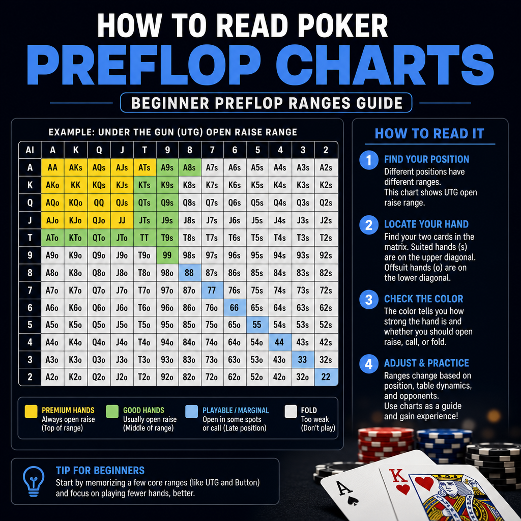 A GTO preflop chart is a visual representation of how to play each starting hand from a specific position or situation. Instead of telling you “play more hands” or “tighten up,” it shows exact or near-exact recommendations based on game theory optimal strategy. For many players, poker preflop charts are the easiest way to see how strategy changes by position and action.
In simple terms, these charts help answer questions like:
A GTO preflop chart is a visual representation of how to play each starting hand from a specific position or situation. Instead of telling you “play more hands” or “tighten up,” it shows exact or near-exact recommendations based on game theory optimal strategy. For many players, poker preflop charts are the easiest way to see how strategy changes by position and action.
In simple terms, these charts help answer questions like:
- Which hands should I open from the button?
- What should I do facing a raise from the cutoff?
- Which hands should I 3-bet, call, or fold?
- How often should some hands be mixed between actions?
- AA
- AKo
- AQs
- 76s
- KJo
Understanding the Range Grid
The foundation of any poker range chart is the hand matrix. This grid organizes all 169 starting hand combinations into a neat visual format.How the grid is laid out
- Rows and columns represent card ranks, from Ace down to 2.
- Pairs run diagonally from top-left to bottom-right, such as AA, KK, QQ, etc.
- Suited hands appear above the diagonal, like AQs or JTs.
- Offsuit hands appear below the diagonal, like AKo or QJo.
- AKs = Ace-King suited
- AKo = Ace-King offsuit
- TT = Tens
- 87s = Eight-Seven suited
The logic behind the colors
Many poker preflop charts use color gradients to help you spot patterns faster. The visual system matters because it shows which hand classes belong together. For example, suited broadways often cluster in similar regions, while weak offsuit combinations are pushed toward folds. That structure makes the chart easier to memorize. Instead of learning 169 random squares, you learn patterns such as “suited hands play better than offsuit hands” and “connected hands gain value in later positions.”Why the matrix matters for beginners
The hand matrix is not just a pretty layout. It helps you understand how a range is built and why some hands appear in one spot but not another. Once that clicks, poker preflop charts stop feeling arbitrary and start feeling systematic.Positions Matter More Than Most Beginners Realize
A hand’s value changes depending on where you are seated. That’s why preflop ranges are always tied to position.Common positions in poker
- UTG: Under the Gun, first to act preflop
- MP: Middle Position
- HJ: Hijack
- CO: Cutoff
- BTN: Button
- SB: Small Blind
- BB: Big Blind
- UTG opening range might include premium pairs, strong broadways, and suited aces.
- Button opening range can include many more hands, including suited connectors, weaker offsuit broadways, and lower pocket pairs.
Position and realization
Position also changes how well your hand realizes equity. Hands with playability, like suited connectors or suited aces, tend to benefit more from late position because they can see more information before committing chips. That’s a big reason why poker preflop charts widen so much as you move from early position to the button.Reading the Actions: Raise, Call, and Fold
Most charts use colors, labels, or percentages to show what to do with each hand. The exact design varies, but the basic actions remain the same.Raise
A raise is usually the primary action in open-raise charts or 3-bet charts. If a hand is marked as a raise, it means you should enter the pot aggressively from that spot. Examples:- Open-raising AJo from the cutoff
- 3-betting AQs against a button open
- Isolating with KQs in late position
Call
A call means the hand is playable but not strong enough to raise in that spot, or the strategy prefers mixing in calls to protect your range. Examples:- Defending QJs in the big blind versus a cutoff open
- Flat-calling 77 against some early-position raises
- Calling with suited broadways in certain versus-raise scenarios
Fold
A fold means the hand is not profitable enough to continue in that specific spot. That does not mean the hand is “bad” in general. It simply means that from that position, against that action, folding is the best play according to the strategy. For example, K9o may be a fold from early position, but playable from the button in many structures. When you review poker preflop charts, it helps to think in action buckets. Ask whether the hand belongs in the opening range, the continue range, or the fold range before worrying about exact percentages.What Mixed Frequencies Mean
One of the most confusing parts of GTO ranges for beginners is the concept of mixed frequencies. This is when a hand is used in more than one action, such as raising some of the time and folding the rest, or mixing between call and 3-bet.Example of a mixed strategy
A chart might show:- A5s: 70% raise, 30% fold
- KQo: 50% call, 50% 3-bet
- TT: 80% 3-bet, 20% call
Why mixed frequencies exist
Mixed frequencies are used because:- Some hands are close in value between two actions
- Balance matters against strong opponents
- Different board runouts and blocker effects make certain actions slightly better or worse
How to Interpret Colors and Labels
Different charts use different visual systems, but most rely on color coding or action labels. You may see:- Green = raise
- Blue = call
- Red = fold
- Yellow or orange = mixed strategy
- Raise 75%
- Call 25%
- Fold 100%
- What spot is this chart for?
- What action am I facing?
- What does each color mean?
- Are mixed frequencies shown as percentages or just as split colors?
A Simple Example: Open-Raising from the Button
Let’s use a simple button opening range to make the chart easier to understand. In this spot, poker preflop charts usually show a wider range because the button has positional advantage and often acts last after the flop. In a typical chart, you might see:- All pocket pairs
- Most suited aces
- Many suited kings and queens
- Broadway hands like KQo, AJo, and KJs
- Suited connectors and some one-gappers
A Simple Example: Facing a Raise in the Big Blind
Defending the big blind is another spot where chart reading matters a lot. You are already invested in the pot, so the chart often includes a mix of calls, 3-bets, and folds depending on the opener’s position. For example, against a cutoff open, the chart may recommend continuing with:- Strong broadways
- Suited broadways
- Connected suited hands
- Many pocket pairs
- Some offsuit broadways and suited wheel aces
How to Use a GTO Chart While Studying
Reading a chart is useful, but using it correctly while studying is where real improvement happens. A chart is not just something to memorize. It’s a tool for pattern recognition.Use a repeatable study process
- Pick one spot only, such as button opens.
- Review the whole range grid slowly.
- Group hands into classes instead of memorizing every square.
- Ask why the chart prefers one action over another.
- Test yourself by covering the chart and recalling the main patterns.
Focus on patterns first
For beginners, patterns matter more than perfect precision. If you know that pocket pairs generally continue more often than weak offsuit hands, or that suited hands play better than offsuit hands, you already understand a large portion of the chart. As you improve, poker preflop charts become a reference point rather than a crutch. You can compare new spots to familiar ones and build intuition faster.Use charts as a baseline, not a cage
Charts are designed to show strong baseline strategy. In real games, player tendencies, stack sizes, rake, and table dynamics can change the best line. A chart gives you the starting point, and then you adjust from there. For that reason, it helps to think of poker preflop charts as training wheels that teach structure. Once you understand the structure, you can start making better exploitative adjustments without losing the foundation.Common Beginner Mistakes
New players often make the same mistakes when reading charts. Avoiding these will make the learning process much smoother.1. Memorizing without understanding
If you only memorize colors, you may forget the strategy as soon as the spot changes. It’s better to learn why a hand belongs in a certain bucket.2. Ignoring position
A hand is never played in a vacuum. The same hand can be a strong open in one position and a clear fold in another.3. Treating mixed hands as random chaos
Mixed frequencies are normal. They do not mean the chart is unclear. They mean the hand is near the boundary between two actions.4. Using one chart for every game
Cash games, tournaments, rake structures, and stack depths all matter. A chart is only as good as the situation it was built for.5. Overvaluing offsuit broadways in early position
Many beginners play too many weak offsuit hands too early. poker preflop charts usually teach the opposite: early-position ranges should be tighter and more selective.Why Preflop Charts Are the Best Starting Point
If you are new to solver-based study, preflop is the best place to start. It is the most structured part of the game, and the decisions are easier to classify than many postflop spots. Preflop charts teach you:- Which hands belong in each range
- How position changes strategy
- How to balance raise, call, and fold actions
- How to recognize mixed-frequency hands
- How to build a disciplined baseline
The Easiest Way to Start Learning GTO Preflop Ranges
The easiest way to learn is to start with one position and one common spot. For example, study button opens first, then cutoff opens, then big blind defense. That keeps the information manageable and makes the patterns easier to remember. As you go, pay attention to how poker preflop charts repeat ideas across spots. Strong hands stay strong, playable suited hands gain value in position, and weak offsuit hands drop out faster than most beginners expect. That repetition is what makes the system learnable. You do not need to master everything in one sitting. You just need to build familiarity until the chart starts to feel intuitive. For a simple next step, use the chart as your baseline during study sessions and compare it to the hands you naturally want to play. Over time, that comparison will sharpen your sense of which hands belong in each range and why.Conclusion
Poker Preflop Charts are one of the most practical tools for learning solid preflop strategy. Once you understand the grid, positions, action labels, and mixed frequencies, the chart stops looking like a spreadsheet and starts looking like a map. The best way to use them is to learn one spot at a time, focus on the patterns, and use the chart as a baseline for study and improvement. If you keep the process simple, poker preflop charts become much easier to read, remember, and apply at the table. With a little repetition, you’ll be able to move from confusion to clarity and turn preflop ranges into something you can actually use.Turn the Grid Into a Preflop Map
Learn one position at a time, recognise the hand-class patterns, and use the chart as a baseline rather than a cage. That is how a 13×13 matrix becomes something you can actually use at the table.